Client
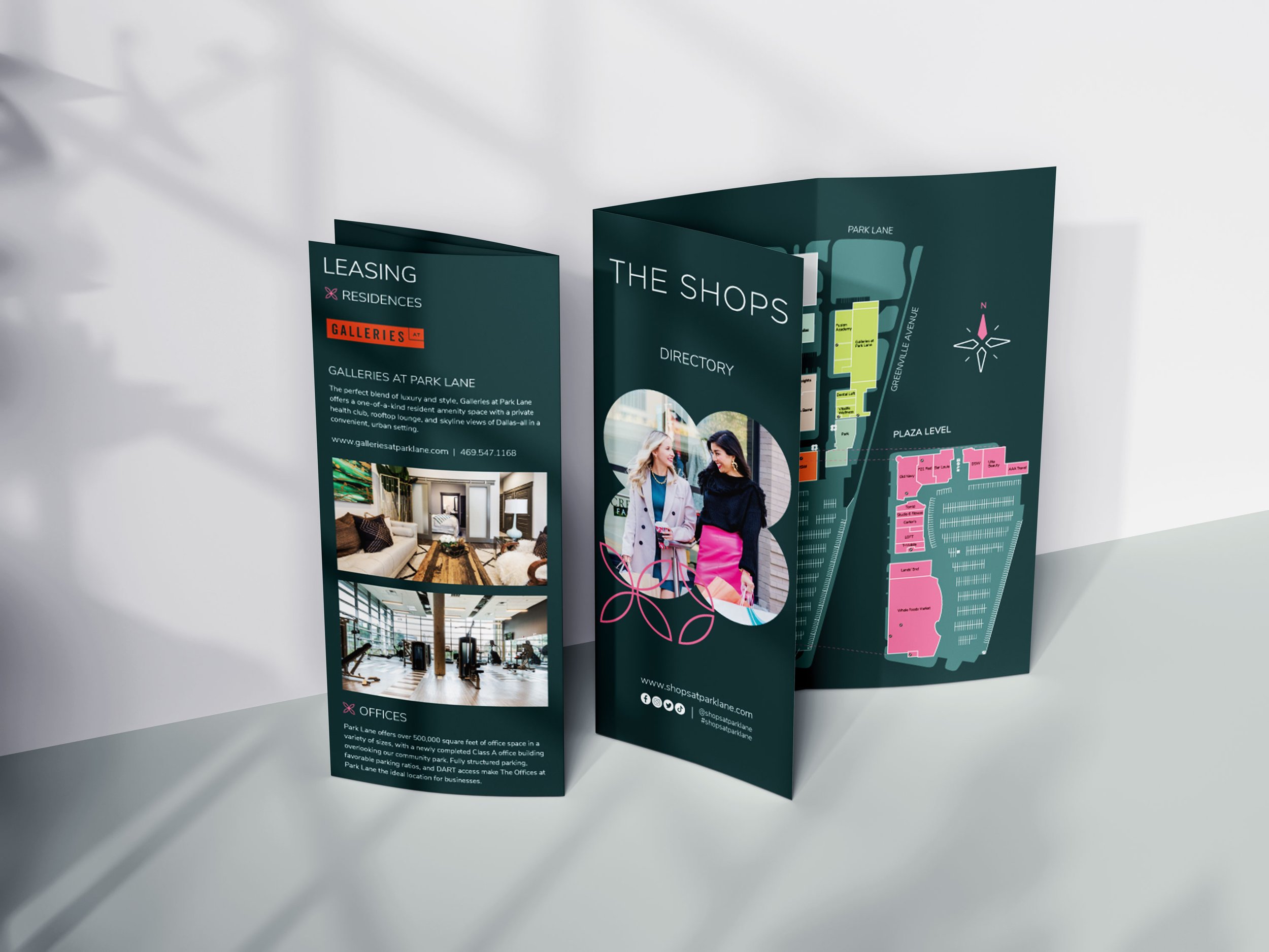
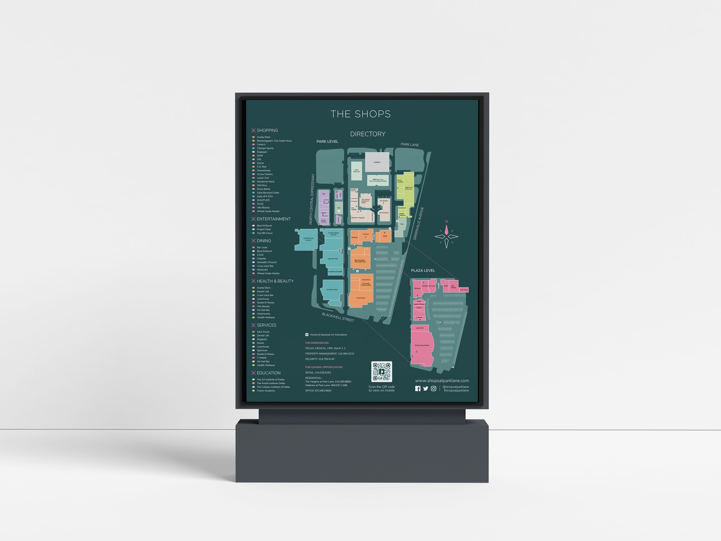
The Shops at Park Lane
Our Roles
Brand Identity
Campaign Visuals
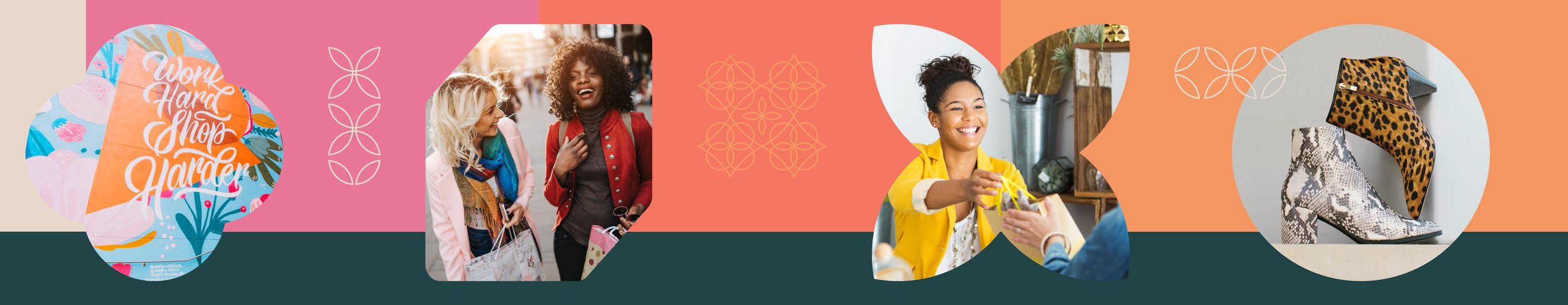
A visual experience with identity
Our team Developed a refreshed brand Identity, flagpole designs, event posters, window clings, art murals, digital & print ads.
Color Palette
Our brand palette embraces five fun and energetic colors (peach, coral, pink, blue, and dark green) that are anchored by four neutrals (white, beige, charcoal, and black). When creating content for The Shops at Park Lane, only these color swatches may be used. Please refer to the color code breakdowns to ensure consistency across all collateral.


A visual experience with identity
Our team Developed a refreshed brand Identity, flagpole designs, event posters, window clings, art murals, digital & print ads.